Design Studio by Saurabh · Remote, US & UK hours
Figma design systems that keep growing products consistent
Design system creation for startups and enterprise teams: Figma tokens, components and documentation that make design faster and products consistent.
As products grow, screens drift apart: five button styles, three greys that are almost the same and every new feature designed from scratch. A design system fixes that with one shared set of tokens, components and rules.
We build design systems in Figma with variables, components, variants and Auto Layout, documented so designers and developers use them the same way. Whether you’re a startup setting up your first library or a larger team untangling years of design debt, we scale the system to what you actually need.
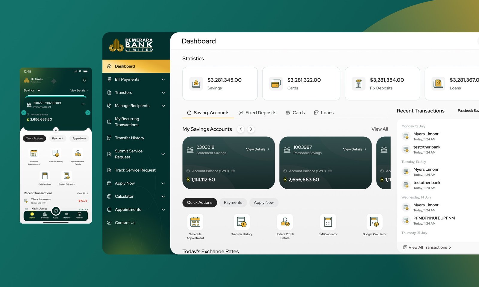
Our design system work includes the shared system behind the Demerara Bank mobile app and web banking revamp: one system, one mental model across web and mobile.
What is included
What we design
Design tokens
colours, type, spacing and radius as Figma variables
Component libraries
buttons, inputs, cards and more, with every state
Light and dark themes
built on semantic tokens and Figma modes
Documentation
usage guidelines your whole team can follow
Design system audits
for products with inconsistent, duplicated UI
Developer handoff
tokens and components that map cleanly to code
Team training
so your designers can maintain and extend the system
The process
How a project works
- 01
UI inventory
We audit your product’s current colours, type, spacing and components to find duplication and gaps.
- 02
Foundations
A small, sensible scale for colour, typography, spacing, radius and elevation, set up as Figma variables.
- 03
Core components
The components your product uses most, with variants, states and Auto Layout.
- 04
Patterns
Forms, navigation, tables, empty states and other patterns built from the components.
- 05
Documentation
When and how to use each component, written for both designers and developers.
- 06
Rollout and training
Help migrating existing screens and a session to train your team.
Deliverables
What you get
| Deliverable | What it is | Format |
|---|---|---|
| UI inventory | What exists today and what to merge | FigJam |
| Token set | Primitive and semantic variables with modes | Figma variables |
| Component library | Components with variants and states | Figma library |
| Pattern library | Reusable layouts and flows | Figma |
| Documentation | Usage guidelines and do’s and don’ts | Figma or Notion |
| Token export | Tokens ready for your developers | JSON |
| Training session | How to use and extend the system | Video call |
Why us
Why work with Design Studio by Saurabh
Built for real products
Systems designed around your actual screens and roadmap, not a generic UI kit.
Figma expertise
Variables, modes, variants and Auto Layout used properly, so the library is fast to use and hard to break.
Developer-friendly
Tokens and components that map cleanly to code, with handoff in Figma Dev Mode.
Right-sized
From a lean starter system for startups to a fuller system for larger teams.
Accessible by default
Colour pairings and focus states checked against WCAG from the start.
From our work
Demerara Bank needed a new mobile app and a revamped web banking system. Building both on one shared design system meant one login, one mental model and a product that could keep growing.
Want to see how we think before we talk? Start with research first, pixels second or how to choose the best UI/UX design studio.
Meet the people behind the work.
Different minds, shared curiosity. A small team making thoughtful products together, from first research to launch.
10 people, one team
Saurabh Yadav
Founder & Lead Designer

Devwrat Pandey
UI/UX Designer

Shiney Jacob
UI/UX Designer

Sanju Vishwash
UI/UX & Motion Designer

Vipin Meena
Product Designer
Sanchita Halder
React Developer

Pallavi Singh
UX Writer

Himanshu Gupta
Developer

Vaibhav Singh
QA Engineer

Chirag Arora
SEO | AEO Specialist
Design
- Saurabh YadavFounder & Lead Designer
- Devwrat PandeyUI/UX Designer
- Shiney JacobUI/UX Designer
- Sanju VishwashUI/UX & Motion Designer
- Vipin MeenaProduct Designer
Writing, engineering, QA & SEO
What does a design system include?
Design tokens for colour, type and spacing, a component library with variants and states, reusable patterns and documentation explaining how to use them, all shared between design and code.
Do startups need a design system?
Most startups need a lean one: a few tokens and the core components. It speeds up design and development and prevents inconsistency, without the overhead of a large enterprise system.
Can you work with our existing UI or developers?
Yes. We usually start from your existing product, merging and cleaning up what’s there, and work with your developers so tokens and components match the code.
How long does it take to build a design system?
A starter system can take a few weeks. A fuller system for a larger product takes longer, depending on the number of components, themes and platforms.
Do you work with clients in the US and UK?
Yes. We’re a design studio based in India working with teams worldwide, remotely in shared Figma files with regular reviews.
Related reading
All articles
Design tokens explained: what they are and how to set them up
Design tokens explained simply: primitive vs semantic tokens, naming conventions, theming and dark mode, and how tokens connect Figma to code.
Read article
Figma design system setup: variables, components and tokens
A practical Figma design system setup: how I structure variables and tokens, build components with variants, and organise a library developers trust.
Read article
Design systems for small teams: start smaller than you think
A practical guide to design systems for small teams: what to build first, what to skip, and how to keep one Figma library useful without a full-time owner.
Read articleLet’s give your product one consistent language
Tell us about your product, your team and where things feel inconsistent today. We’ll reply with how we’d approach your design system. Just share your project details.